 I spent the weekend doing two things: trying to relax, and editing the novelette.
I succeeded in the latter.
Editing went well, both on the story and on the cover art.
Each editing pass revealed fewer errors–reaching zero by the fourth pass–and fewer lines that gave me pause. Eventually, in editing, I like to get to the point where for each possible change, I have to think, play it two or three ways, and then end up with a STET in the margin.
My last pass, I also took special note of the “said” use. They’re still there (despite my earlier efforts), but now each one that is in the story has been considered. If it’s there, I want it there, and I’m happy with that.
The cover art never changed in concept from my earliest mockups. There were some enhancements, and some backtracking. I tell you, the hardest thing is the font, these days. For you indies, remember when you create your cover that it has to be fairly legible when it’s in thumbnail form. The challenge for this story was twofold.
First, and always, my last name. It’s long, and it’s impossible to read in thumbnail mode, so I cede that ground and move on.
The title of this novelette, however, is also a bit long, especially with “revitalization” in there. Breaking the title to two lines was a no-brainer, but in order to get “revitalization” to the proper size for thumbnail legibility, I needed to go to three lines. Three lines took up too much real-estate, so we have a compromise. Legibility at thumbnail size is marginal, but acceptable.
So, now I’m formatting and prepping for Kindle distribution.
Look for it, soon…
k
 Unraveling Time
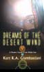 Desert Wind
 Ploughman's Son
 Ploughman King
 The Year the Cloud Fell
 The Spirit of Thunder
 Shadow of the Storm
 The Cry of the Wind
 Beneath a Wounded Sky
 Cryptogenesis: A Memoir
I agree about the title being long, but in thinking about it a bit, I think it’s fine. Sometimes, it’s just what you have to do. When what fits just, fits, what else is one to do but what one has to? 🙂
LikeLike
Weirdly, if the title had been longer, there are tricks I could have pulled with mixed font sizes and such that could have made for a smaller footprint. Six-syllable words are always a tough one, though.
LikeLike